Sunday, December 11, 2011

FINALS

When creating each of my final pieces, a lot of thought goes into each scene in hopes that I can work out a setting that can evoke as much emotion from the reader. As you can see from this post, I work out plenty of drafts before I find a stance that I like. Each image is intended to be looked at for a while, ad it's easy to miss out little details when going through too fast. The images were paired off with crude spelling and bad handwriting to work as a balance between the sad drawings, and provide some sort of comic relief.
---


IMAGE 1: In this scene, a smallpaw is born to two bigfoot parents. The smallpaw is in the nest at his parent's feet, and the parents weep out of pity in understanding the social hardships of raising smallpaw, a creature thought to be a leech on bigfoot society (as smallpaws are deemed as a totally different species unable to contribute to a community). Bigfoot parents cry because they know that from this point on, Smallpaw's life will be a tough one.

IMAGE 2: Viewer gets first glimpse of bigfoot society, as another Mama bigfoot disdainfully shields her son's eyes from the Smallpaw offering his hand in friendship. Being discriminatory isn't a trait bred in anyone, bigfoots included, it is a trait that is taught. You also see how narrow-minded and unforgiving the bigfoot society is because of this.


IMAGE 3: In terms of composition, this is kind of the odd-one-out in this set, but I think it works out. I wanted to capture how small Smallpaw feels when next to his bigfoot counterparts. Because there are not too many sharp differences between Bigfoot and Smallpaw, I wanted one frame to clearly split the two. Because you only see the sheer size of the Bigfoot, they look like an entire creature completely. I also wanted to add to Smallpaw, and show his bravery- that a simple activity as going on a run is lethal because of his size- a foot's as big as his torso!


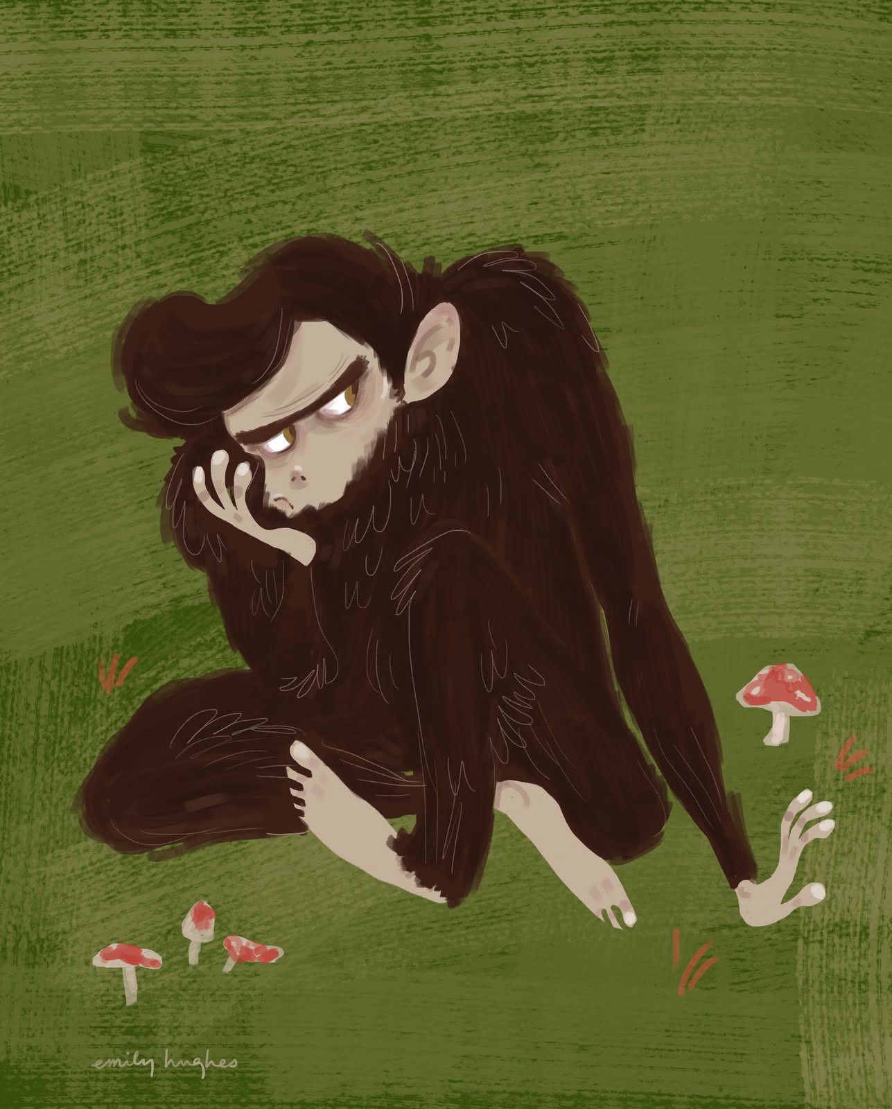
IMAGE 4: This frame shows Smallpaw being tormented by his peers. It looks as if they're just older bullies, but not true, they're his age, or even younger. Smallpaw and his peers would have basically finished growing out at this point. Keep in mind that Smallpaws are kind of like the more-evolved members of society and have a more human-like build, which is downright puny in Bigfoot terms. Nonetheless, Smallpaw's peers never let off an opportunity to let him feel unwelcome and ashamed.


IMAGE 5: To me, this is the most powerful image in the book when paired with the text. I wanted a simple approach to showing Smallpaw's loneliness. At first I wanted a more dark, dense forest to mirror off his gloom, but I decided against this- a bit too intense. I thought it would be even more sad if I paired it off with the above image- where Smallpaw escapes his bullies in the thicket, and is left with a moment to be completely by himself, feeling more alone than ever after such a happening. The text is important in this piece too. Smallpaw wants to be honest when writing his text, but is embarrassed to put too many of his emotions in, he is part bigfoot, still.


IMAGE 6: Smallpaw leaves the only home he's ever known, and the only friends he's ever had, his parents. This is a pivotal time for Smallpaw. Though he is scared to go, he is more scared to leave behind his parents, his Mother's emotion mimics her initial emotion in the first frame- she knew this day would come. Smallpaw feels guilt and sadness in leaving, but is looking forward to a fresh new start.


IMAGE 7: I had a hard time in trying to stylistically draw the mountains in the scene. Until this point, the only scenery the viewer gets is trees and grass, I wanted to include new scenery- a mountain and river to show that it's a big big world out there, and Smallpaw is getting to see all of it. At this point, Smallpaw is optimistic- he meets new ones like him, and he is seeing a very different world than the closed Bigfoot world he came from.


IMAGE 8: This image and the next were added into the story after a crit with Joel, Lisa, Marcus and Salvatore who wanted more of Smallpaw's journey before arriving to the city. This is an exciting moment in Smallpaw's life, he has new companions on the trip, and his first outside friends. Smallpaw is the eager one on the left. The backdrop of this scene is similar to Image 5, but this time the atmosphere is different, it is warm and full of friends. The three smallpaw's emotions are reflected in their fire, they are full of energy, and optimism for their new life.


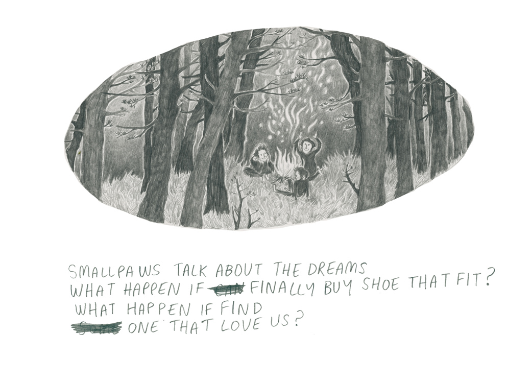
IMAGE 9: As time goes on that same night as Image 8, weariness and nervousness set in, the Smallpaw talk about their fears, where to go if no one can accept them. Again, the fire reflects the Smallpaw's feelings- the spark has gone out, and the only thing that remains is the sober rolling smoke.


IMAGE 10: Smallpaw sees the city- I was going to incorporate his two traveling buddies, but I thought it would be more powerful if our hero found the city out on his own. I'm unhappy with the look of the city- just not my element at ALL, haha. I tried to make it London, you can see the Gherkin. I wanted the cliff to split the complete differences between the Bigfoot forest and the Human 'forest'. The intrigue and intimidation Smallpaw must be feeling!


IMAGE 11: The city! It might be hard to totally get, but Smallpaw is supposed to be the model on the big billboard. You don't get to see any totally detailed drawings of Smallpaw and his face, but I thought that the overall hairiness, brow and very outward ears would prove Smallpaw's identity. If the viewer doesn't catch this, you can look closely into the crowd of people crossing the roads and window shopping you'll spot many Smallpaws. The bus driver and window display decorator, are Smallpaws for instance. Smallpaws thrive!

---
SIDE NOTE

In case you haven't already figured it out, Smallpaw is the author of the story- as shown by his limited English-as-second-language type writing. The oval shapes I used as a template were chose to be done imperfectly, because having it too perfect and measured would be too 'human'. I also really liked the thought that from a distance they look really organic, like a pebble or river stone. On closer notice, I think the drawing style is pretty sketchy and a bit primitive as well. I was going to use ink as a medium, but in the end felt that pencil shows more emotion, and looks a bit more naive- something I thought would be more fitting for Smallpaw.

John Bauer


Thought the amazing John Bauer would be something good to add to this blog. I can comfortably say he's my favorite illustrator, and he definitely inspired the look and feel when I was working on Smallpaw, if not my whole illustration practice. I love the dark Swedish forests he paints, and the always simplified figures he draws, everything is so to-the-point, but he always manages to create a strong atmosphere, just what I wanted in my own work.

Tuesday, December 6, 2011

BARRACUDA

DON'T JUDGE ME BADLY ON THIS
BUT


I don't know if this seems relevant or not, but I've been listening to some cheesy Heart (I know, typical video) for the past few days to keep myself awake-

The drummer is totally a yeti.
It might sound like some bs, but the shaggy hairstyles in the band make for such good reference, I've been learning a lot!

Testing out a palette


This is a early developmental digital colorscript when I was figuring out my medium for this project, and whether I should use color. For this one, I kept a simple four color scheme palette. It was a really good exercise for me to contextualize my ideas quickly with the help of my graphics tablet- I feel like I still captured the raw sketchiness I have in my sketchbook with it. It also helped me with my development of the cover sleeve (the first image).
I liked this approach, but felt that the only way to keep it spontaneous and alive had to be a very quick, rushed process which I wouldn't feel comfortable in presenting. I also felt that having a digital medium would totally take away from the primitive text and overall way of the bigfoot.

In other related news

In my learning agreement I vowed to participate in more competitions. One competition I was keen on entering was something I had always said I was going to do, but never gave myself the time to do so. Because this year was my last shot, I figured I'd take the chance and give it a go.

I entered the AUCB hoodie design mini competition at school,
and luckily my design got chosen!

Profile Studies

I had the last big crit of the unit in class two weeks ago. We looked at all our progress for our unit up to that time, and we were lucky enough to get help on our work from our four tutors.

One piece of advice that resonated with me was to change the design of 'smallpaw'- they thought it be best if I in turn gave him less hair, to make him less bigfoot, instead of just focusing on his overall size. I tried many different sketches for a smallpaw without hair, but he in turn always just ended up looking/being a boy trapped with bigfoots, changing my story entirely. I also had a hard time figuring how to cover his errr, area, because no bigfoot wears pants! In the end, I just tried to figure out a code of how smallpaws look and are built in comparison to the bigfoots.

This is just a skull study I drew out-

Smallpaw: I wanted the smallpaw to have a more 'developed' skull, as I wanted them to be much more relatable to humans than the bigfoot. In the end, the only thing that does set him apart from humans is the abundant hair.

Bigfoot: Bullet-shaped head, thicker hair. The brow is much more protruded, and usually (but not always) the jaw juts out into an underbite. I wanted the bigfoot skull in turn look much more primitive when sided with smallpaw.

Character study


This is a smallpaw I drew one night. This was done more for character design purposes for an internship portfolio, rather than for the actual finished story itself. It was also nice to get a finalized and more detailed study of the smallpaw, since I've mainly been focusing on scribbly little ones more fitting for my narrative. There are a few things I was generally unhappy about in this finish in relation to the book's protagonist. I thought this rendition looked a bit 'chimp-y', rather than hairy human creature. I also thought he looked a bit more bulky than I intended. I am happy with the color scheme and his 'bored of this forest' attitude going on, though, ha.

Layout ideas


They speak for themselves! These are a few of the layouts I tested out digitally.

DEVELOPING SMALLPAW

Because Smallpaws can easily look like monkeys, boys or just baby bigfoots, I had a hard time trying to figure a formula to them. Also I wanted to add a bit of sophistication to the characters- smallpaws are the complete opposite of bigfoots- they are small, dainty, clever, but pretty dweeby- I'm thinking Paul Simon.
I like the idea that these small paws have necks in contrast to bigfoot, and that they look like they're wearing dark turtlenecks and jeans- to me they feel like 1960's beatnik boys and that's exactly the kind of creature I want them to be, the little ones in cafes smoking, listening to poetry and hating on the bourgeois.

BIGFOOT STUDY

Bigfoots are rude, crude, dirty and dumb. They're the reason young people leave their small towns- to escape them, or becoming one of them. In Hawaii we have the affectionate term, 'moke' which I based my study on them for. Mokes are Hawaii's 'redneck' equivalent, and speak in a very loud, pidgin-English dialect, which in turn sounds like Bigfoot talk. Here's a video to prove it's validity (the guy in the blue shirt).

Primary

Some early drafts I drew out trying to figure out the bigfoots shape. These sketches were done to get my idea out for Pictoplasm's 'Missing Link' competition, which I ended up not entering :/. At this point, I was actually looking more into the yeti aspect- the white bigfoot cousin up in the mountains, as I thought all the sweeping hair would be fun to test out. In the end, I thought that the differences between bigfoot and not-so-big-foots would be much more apparent than the differences between yeti and a deformality.

errrrr


Here's some early sketch designs I had when trying to figure out the bigfoot character (at this point it was only to figure out what to use for the Pictoplasm competition rather than for a book). I really like the swirly hair of the first image and the conical head of the second one- I feel like that is my strongest suit for capturing the look I want for Bigfoot.

YETI

I really liked drawing this type of character, but early on in the process I ruled out yetis, even if they're my favorite mythical creature :(.

Story ideas

This is the first entry into this blog, as this is one of my first real sketches I did of bigfoots with a story in mind (you can read the short and sweet synopsis on the page). I am going to do 8-9 frames for this book, I want to keep it simple so I am not too easily bored with this unit!